The Color Trends Defining 2026 Interiors
From warm neutrals to playful brights—what’s in and how to use it
If the last few years of interiors were about calming everything down, 2026 is about warming things up—and letting personality back in.
Color is no longer just a backdrop. It’s a mood-setter, a comfort cue, and sometimes even the main character. This year’s palette strikes a beautiful balance between grounding neutrals and expressive pops that feel joyful rather than overwhelming.
Whether you’re planning a full refresh or just itching to repaint something, these are the color trends shaping 2026 interiors—and how to use them in a way that feels elevated, livable, and very now.
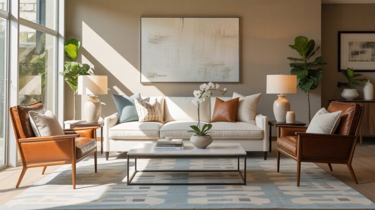
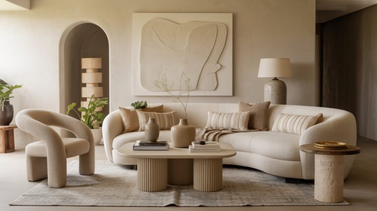
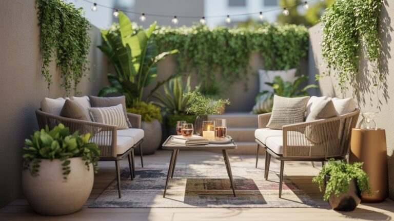
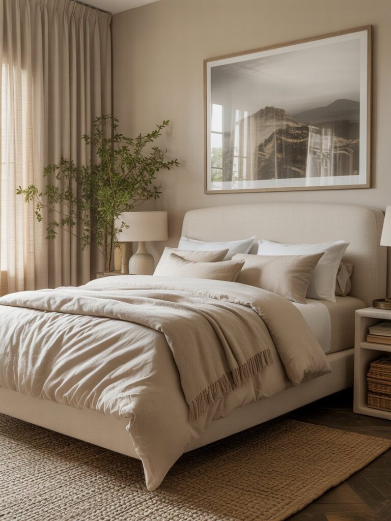
1. Warm Neutrals Take Over (Goodbye, Cold Gray)
Cool grays and stark whites are officially stepping aside. In their place: warm, cozy neutrals with depth and softness.
Think creamy oat, soft sand, mushroom taupe, warm greige, and light caramel. These tones make spaces feel welcoming and timeless—without feeling flat or boring.
How to use it:
- Replace bright white walls with warm off-whites or soft beiges
- Layer similar neutral tones for a rich, collected look
- Pair with natural materials like oak, linen, wool, and stone
2. Earthy Reds & Terracottas Make a Sophisticated Return
Red is back—but it’s grounded, earthy, and refined. Terracotta, burnt sienna, clay, and rust are leading the way.
These hues add warmth and personality while still feeling grown-up and versatile.
How to use it:
- Accent walls in dining rooms or entryways
- Upholstered chairs or benches
- Decorative accents like pottery, pillows, or artwork

3. Nature Greens Go Deeper and Moodier
Green continues its reign in 2026, shifting away from pale sage toward deeper, richer tones inspired by forests and foliage.
Expect moss, olive, pine, and deep fern shades that feel grounding and luxurious.
How to use it:
- Kitchen cabinets or built-ins
- Bedrooms for a cocoon-like feel
- Bathrooms paired with stone or brass

4. Playful Brights (Used Intentionally)
Color gets a little more playful in 2026—but always with intention. Instead of dominating a space, brights appear as thoughtful accents.
Trending pops include soft coral, butter yellow, sky blue, lilac, and fresh turquoise.
How to use it:
- Statement chairs or bar stools
- Painted interior doors
- Lamps, art, or decorative accents

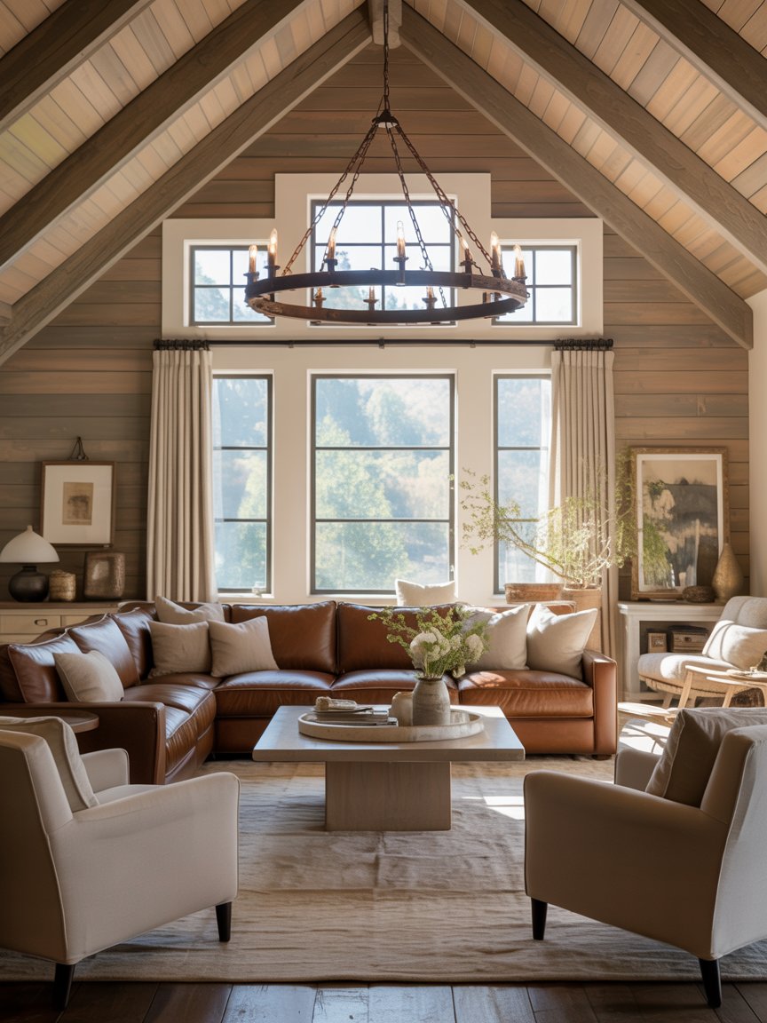
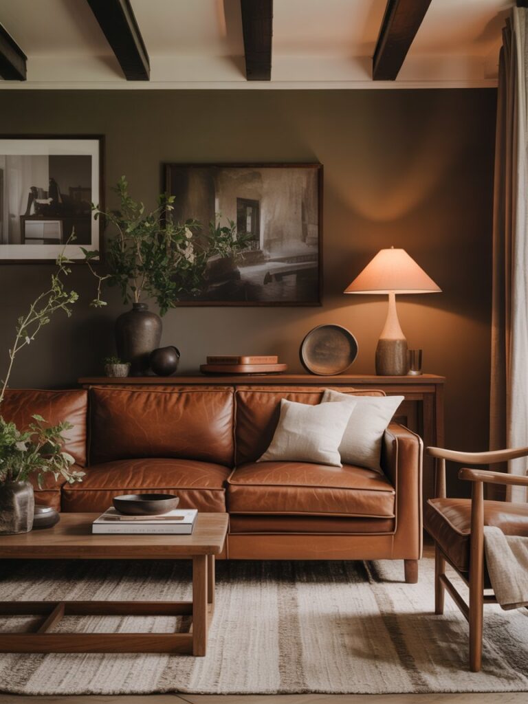
5. Brown Is Officially Cool Again
Brown is having a major comeback—this time in rich, layered, modern tones like chocolate, espresso, mocha, and walnut.
It adds warmth, depth, and a sense of permanence that feels comforting and elevated.
How to use it:
- Leather sofas or chairs
- Wood furniture and cabinetry
- Rugs, throws, and curtains
6. Tonal Rooms Feel Intentional (and Expensive)
Instead of high contrast, 2026 interiors lean into tonal color stories—using multiple shades of the same color family for a cohesive, designer look.
This approach creates calm, depth, and visual harmony.
How to use it:
- Match wall color with furniture in lighter or darker tones
- Layer textiles within the same color family
- Keep finishes soft and complementary
7. Black Softens Into Charcoal
Black isn’t disappearing—it’s just evolving. Charcoal, soft black, and inky gray tones offer contrast without feeling harsh.
How to use it:
- Interior doors or window frames
- Lighting and hardware
- Accent furniture

How to Choose the Right Trend for Your Space
Before committing, ask yourself:
- Does this color energize or calm me?
- How does it look in natural vs. evening light?
- Can I introduce it through decor before painting walls?
Color should support how you want your home to feel, not just what’s trending.
One Last Thing…
The biggest color trend of 2026 isn’t a specific shade—it’s confidence. Homes are moving away from playing it safe and toward spaces that feel personal, warm, and expressive. Whether you embrace cozy neutrals, moody greens, or a pop of joyful color, the best interiors this year are the ones that reflect you.
And that’s always in style.